7-背景 雪碧图与渐变

7-背景 雪碧图与渐变

CSS背景,雪碧图与渐变

背景参数

  • background-color 设置背景颜色

  • background-image

    设置背景图片

    • 如果背景图片大小小于元素,则背景图片会自动在元素中平铺将元素铺满
    • 如果背景图片大小大于元素,则背景图片一部分会无法完全显示
    • 如果背景图片大小等于元素,则背景图片会直接正常显示
  • background-repeat

    设置背景图片的重复方式

    • repeat 默认值,背景图片沿着 x 轴和 y 轴双方向重复
    • repeat-x 背景图片沿着 x 轴方向重复
    • repeat-y 背景图片沿着 y 轴方向重复
    • no-repeat 背景图片不重复
  • background-position

    设置背景图片的位置

    • 通过top left right bottom center几个表示方位的词来设置背景图片的位置:使用方位词时必须要同时指定两个值,如果只写一个则第二个默认就是center
    • 通过偏移量来指定背景图片的位置:水平方向偏移量、垂直方向变量
  • background-clip

    设置背景的范围

    • border-box 默认值,背景会出现在边框的下边
    • padding-box 背景不会出现在边框,只出现在内容区和内边距
    • content-box 背景只会出现在内容区
  • background-origin

    背景图片的偏移量计算的原点

    • border-box 背景图片的变量从边框处开始计算
    • padding-box 默认值,background-position从内边距处开始计算
    • content-box 背景图片的偏移量从内容区处计算
  • background-size

    设置背景图片的大小

    • 第一个值表示宽度,第二个值表示高度;如果只写一个,则第二个值默认是auto
    • cover 图片的比例不变,将元素铺满
    • contain 图片比例不变,将图片在元素中完整显示
  • background-attachment

    背景图片是否跟随元素移动

    • scroll 默认值,背景图片会跟随元素移动
    • fixed 背景会固定在页面中,不会随元素移动

简写:

backgound 背景相关的简写属性,所有背景相关的样式都可以通过该样式来设置并且该样式没有顺序要求,也没有哪个属性是必须写的

注意

  • background-size必须写在background-position的后边,并且使用/隔开background-position/background-size
  • background-origin background-clip 两个样式,orgin要在clip的前边

练习(背景按钮)

1
2
3
4
5
6
7
8
9
10
11
12
13
14
15
16
17
18
19
20
21
22
23
24
25
 <style>
a:link{
/* a是行内元素不支持背景,转换为块元素支持。 */
display: block;
width: 93px;
height: 29px;
background-image: url('./exercise/img/link.png');
}
a:hover{
/* a是行内元素不支持背景,转换为块元素支持。 */
display: block;
width: 93px;
height: 29px;
background-image: url('./exercise/img/hover.png');
}
a:active{
/* a是行内元素不支持背景,转换为块元素支持。 */
display: block;
width: 93px;
height: 29px;
background-image: url('./exercise/img/active.png');
}
</style>

<a href="#"></a>

效果:

背景按钮

在刚进入网页的时候,只加载了link一张图,当达到触发条件的时候才会加载剩下两张,所以第一次点击的时候会出现突然发白的现象。

雪碧图

解决图片闪烁的问题:

可以将多个小图片统一保存到一个大图片中,然后通过调整background-position来显示响应的图片

这样图片会同时加载到网页中就可以有效的避免出现闪烁的问题

这个技术在网页中应用十分广泛,被称为CSS-Sprite,这种图我们称为雪碧图

雪碧图的使用步骤:

  1. 先确定要使用的图标
  2. 测量图标的大小
  3. 根据测量结果创建一个元素
  4. 将雪碧图设置为元素的背景图片
  5. 设置一个偏移量以显示正确的图片

雪碧图的特点:

  • 一次性将多个图片加载进页面,降低请求的次数,加快访问速度,提升用户的体验

合成的图片

1
2
3
4
5
6
7
8
9
10
11
12
13
14
15
16
17
18
19
20
<style>
a:link {
display: block;
width: 93px;
height: 29px;
background: url("./exercise/img/btn.png");
/* 默认值,可以不设置 */
background-position: 0 0;
}

a:hover {
/* 设置水平方向的一个偏移量;注意是向左移动,所以是负值 */
background-position: -93px 0;
}

a:active {
/* 设置水平方向的一个偏移量;注意是向左移动,所以是负值 */
background-position: calc(-93px * 2) 0;
}
</style>

线性渐变

通过渐变可以设置一些复杂的背景颜色,可以实现从一个颜色向其他颜色过渡的效果

渐变是图片,需要通过background-image来设置

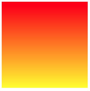
线性渐变,颜色沿着一条直线发生变化 linear-gradient()

1
2
# 红色在开头,黄色在结尾,中间是过渡区域
background-image: linear-gradient(red, yellow);

渐变

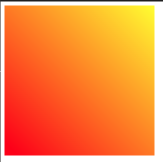
线性渐变的开头,我们可以指定一个渐变的方向

  • to left
  • to right
  • to bottom
  • to top
  • deg deg 表示度数
  • turn 表示圈
1
background-image: linear-gradient(45deg, red, yellow);

角度渐变

repeating-linear-gradient() 可以平铺的线性渐变(默认状况下和上图一样)

1
background-image: repeating-linear-gradient(red, yellow);

线性平铺

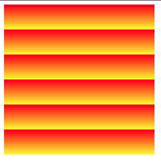
1
background-image: repeating-linear-gradient(red 0px, yellow 50px);

设置高度

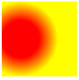
径向渐变

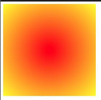
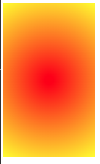
radial-gradient() 径向渐变(放射性的效果)

1
background-image: radial-gradient(red, yellow);

image-20240308204351445

默认情况下,circleellipse是自动适配盒子的,我们也可以手动指定径向渐变的形状

形状

  • circle 圆形
  • ellipse椭圆
1
background-image: radial-gradient(circle, red, yellow);

圆心图形

也可以指定渐变的位置

位置

  • top
  • right
  • left
  • center
  • bottom
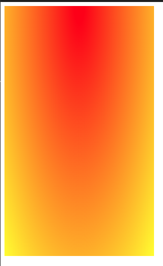
1
background-image: radial-gradient(at top, red, yellow);

位置在上

当然,除了上述值,还可以指定像素

1
2
background-image: radial-gradient( at 50px 100px, red 50px, yellow 100px);

大小

  • closest-side 近边
  • farthest-side 远边
  • closest-corner 近角
  • farthest-corner 远角
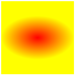
1
background-image: radial-gradient(100px 60px, red, yellow);

指定渐变大小

同时对其形状/大小和位置进行指定

radial-gradient(形状/大小 at 位置, 颜色 位置, 颜色 位置, 颜色 位置)

1
background-image: radial-gradient(circle at 50px 100px, red 50px, yellow 100px);

形状大小颜色

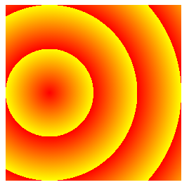
1
background-image: repeating-radial-gradient(circle at 50px 100px, red 50px, yellow 100px);

径向渐变的重复

总结:径向渐变的渐变方向以圆心为起点,往四周扩散的;同一半径上的颜色是渐变的,同一圆周上的颜色是一致的

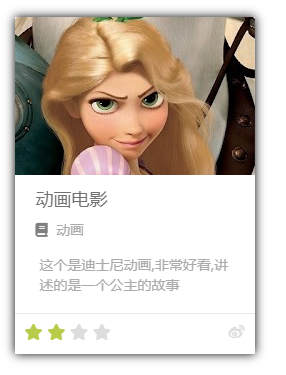
练习(电影卡片)

1
2
3
4
5
6
7
8
9
10
11
12
13
14
15
16
17
18
19
20
21
22
23
24
25
26
27
28
29
30
31
32
33
34
35
36
37
38
39
40
41
42
43
44
45
46
47
48
49
50
51
52
53
54
55
56
57
58
59
60
61
62
63
64
65
66
67
68
69
70
71
72
73
74
75
76
77
78
79
80
81
82
83
84
85
86
87
88
89
90
91
92
93
94
95
96
97
98
99
100
101
    <style>
.outer {
width: 240px;
margin: 40px auto;
/* 设置影音 */
box-shadow: 0 0 10px rgb(0, 0, 0.3);
}

.img-wrapper img {
width: 100%;
}

.info {
padding: 0 21px;
}

/* 设置标题 */
.info .title {
color: #717171;
font-size: 18px;
margin: 13px 0 15px 0;
}

/* 设置分类 */
.info .category {
color: #acaaaa;
font-size: 14px;

}

.info .category::before {
content: "\f02d";
/* font-family: 'Font Awesome 5 Brands'; */
font-family: "Font Awesome 5 Free";
font-weight: 900;
margin-right: 4px;
color: gray;
}

/* 设置简介 */
.info .intro {
margin: 18px 4px;
color: #acaaaa;
font-size: 14px;
line-height: 20px;

}

.star-wrapper {
border-top: 1px solid #e9e9e9;
height: 20px;
padding: 10px;
color: #ddd;
}

.star {
float: left;
}

.star-wrapper .light {
color: #b9cb41;
}

.fa-weibo {
float: right;
}
</style>
</head>

<body>
<!-- 外部包裹的容器 -->
<div class="outer">
<!-- 图片容器 -->
<div class="img-wrapper">
<img src="./img/10/1.png" alt="">
</div>
<!-- 内容区容器 -->
<div class="info">
<h2 class="title">
动画电影
</h2>

<h3 class="category">
动画
</h3>
<p class="intro">
这个是迪士尼动画,非常好看,讲述的是一个公主的故事
</p>
</div>
<!-- 评分容器 -->
<div class="star-wrapper">
<ul class="star">
<li class="fas fa-star light"></li>
<li class="fas fa-star"></li>
</ul>
<span class="fab fa-weibo"></span>
</div>
</div>
</body>

效果:

电影卡片