CSS变形:平移、旋转与缩放
平移
translateX() 沿着由方向平移translateY() 沿着 y 轴方向平移translateZ() 沿着 z 轴方向平移平移元素
百分比是相对于自身计算的
几种水平垂直双方向居中的方式对比
绝对定位的方式
1
2
3
4
5
6
7
|
position: absolute;
top: 0;
left: 0;
bottom: 0;
right: 0;
margin: auto;
|
定位 - Hexo (gitee.io)
table-cell的方式
1
2
3
4
|
display: table-cell;
vertical-align: middle;
text-align: center;
|
transform的方式
1
2
3
4
5
|
position: absolute;
left: 50%;
top: 50%;
transform: translateX(-50%) translateY(-50%);
|
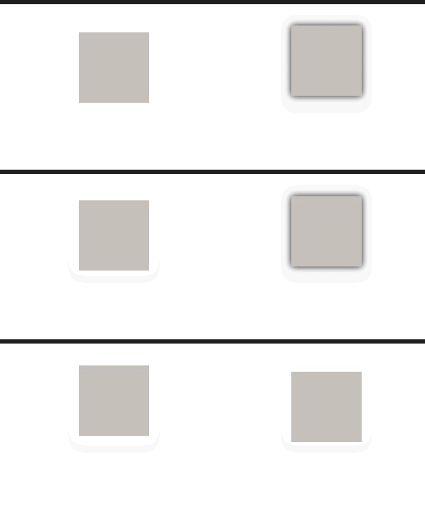
用平移实现浮动效果:
1
2
3
4
5
6
7
8
9
10
11
12
| .box1{
width: 300px;
height: 300px;
background-color: rgb(197, 192, 186);
margin: 40px auto;
transition: transform .3s;
}
.box1:hover{
background-color: rgb(197, 192, 186);
transform: translateY(-10px);
box-shadow: 0 0 10px rgb(0, 0, 0.3);
}
|
z 轴平移
z 轴平移,调整元素在 z 轴的位置,正常情况就是调整元素和人眼之间的距离,距离越大,元素离人越近
z 轴平移属于立体效果(近大远小),默认情况下网页是不支持透视,如果需要看见效果必须要设置网页的视距
1
2
3
4
5
6
7
8
9
10
11
12
13
14
15
16
17
18
| <style>
body{
perspective: 800px;
}
.box1{
width: 100px;
height: 100px;
background-color: rgb(197, 192, 186);
margin: 40px auto;
transition: .3s;
}
.box1:hover{
background-color: rgb(197, 186, 189);
transform: translateZ(100px);
}
</style>
|

旋转
通过旋转可以使元素沿着 x、y 或 z 旋转指定的角度
rotateX()rotateY()rotateZ()
注意:旋转后如果进行平移,是根据旋转后图形所在的坐标系决定的
1
2
3
4
|
transform: rotateY(180deg);
backface-visibility: hidden;
|

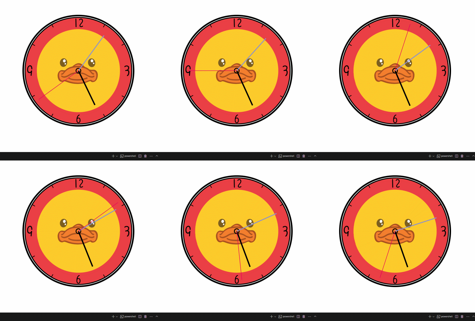
练习(钟表)
1
2
3
4
5
6
7
8
9
10
11
12
13
14
15
16
17
18
19
20
21
22
23
24
25
26
27
28
29
30
31
32
33
34
35
36
37
38
39
40
41
42
43
44
45
46
47
48
49
50
51
52
53
54
55
56
57
58
59
60
61
62
63
64
65
66
67
68
69
70
71
72
73
74
75
76
77
78
79
80
81
82
83
84
85
86
87
88
89
90
91
92
| <style>
.clock {
position: relative;
width: 500px;
height: 500px;
background-image: url(./img/13/bg3.jpg);
background-size: cover;
margin: 70px auto;
border-radius: 50%;
border: 7px solid black;
}
.clock>div {
position: absolute;
left: 0;
right: 0;
bottom: 0;
top: 0;
margin: auto;
}
@keyframes run {
form {
transform: rotateZ(0);
}
to {
transform: rotateZ(360deg);
}
}
.hour-wrapper {
width: 70%;
height: 70%;
animation: run 360s ;
}
.hour {
height: 50%;
width: 6px;
background-color: black;
margin: 0 auto;
}
.min-wrapper {
width: 80%;
height: 80%;
animation: run 30s steps(60) infinite;
}
.min {
height: 50%;
width: 4px;
background-color: rgb(142, 146, 204);
margin: 0 auto;
}
.sec-wrapper {
width: 90%;
height: 90%;
animation: run 0.5s steps(60) infinite;
}
.sec{
height: 50%;
width: 2px;
background-color: rgb(233, 2, 90);
margin: 0 auto;
}
</style>
</head>
<body>
<div class="clock">
<div class="hour-wrapper">
<div class="hour"></div>
</div>
<div class="min-wrapper">
<div class="min"></div>
</div>
<div class="sec-wrapper">
<div class="sec"></div>
</div>
</div>
</body>
|
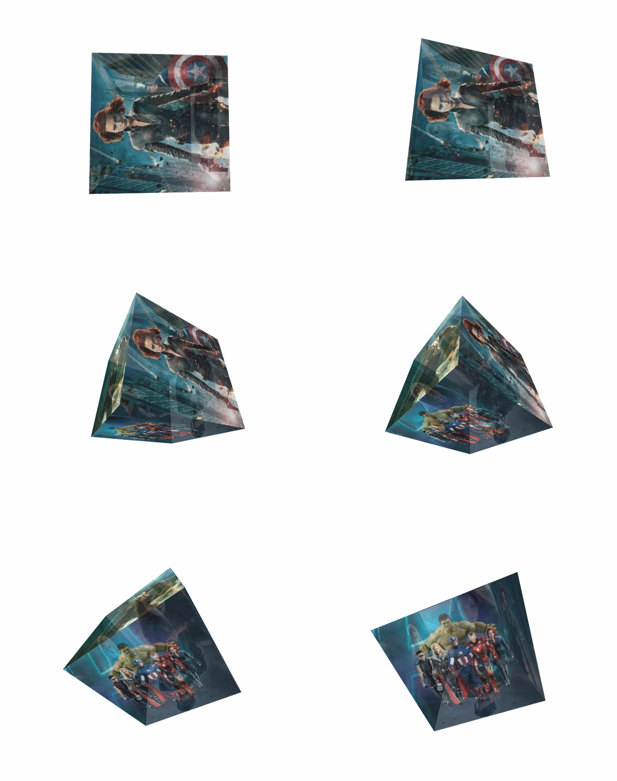
练习(旋转立方体)
1
2
3
4
5
6
7
8
9
10
11
12
13
14
15
16
17
18
19
20
21
22
23
24
25
26
27
28
29
30
31
32
33
34
35
36
37
38
39
40
41
42
43
44
45
46
47
48
49
50
51
52
53
54
55
56
57
58
59
60
61
62
63
64
65
66
67
68
69
70
71
72
73
74
75
76
77
78
79
80
81
82
83
84
85
86
87
88
89
90
91
| <style>
body {
perspective: 300px;
}
.cube {
width: 200px;
height: 200px;
margin: 170px auto;
transform-style: preserve-3d;
animation: cube_rotate 20s infinite linear;
}
@keyframes cube_rotate {
from {
transform: rotateX(0) rotateZ(0);
}
to {
transform: rotateX(1turn) rotateZ(1turn);
}
}
.cube>div {
width: 200px;
height: 200px;
opacity: 0.7;
position: absolute;
}
img {
vertical-align: top;
}
.box1 {
transform: rotateY(90deg) translateZ(100px);
}
.box2 {
transform: rotateY(-90deg) translateZ(100px);
}
.box3 {
transform: rotateX(90deg) translateZ(100px);
}
.box4 {
transform: rotateX(-90deg) translateZ(100px);
}
.box5 {
transform: rotateY(180deg) translateZ(100px);
}
.box6 {
transform: rotateX(0deg) translateZ(100px);
}
</style>
</head>
<body>
<div class="cube">
<div class="box1">
<img src="./img/14/1.jpg" alt="">
</div>
<div class="box2">
<img src="./img/14/2.jpg" alt="">
</div>
<div class="box3">
<img src="./img/14/3.jpg" alt="">
</div>
<div class="box4">
<img src="./img/14/4.jpg" alt="">
</div>
<div class="box5">
<img src="./img/14/5.jpg" alt="">
</div>
<div class="box6">
<img src="./img/14/6.jpg" alt="">
</div>
</div>
</body>
|
缩放
对元素进行缩放的函数
scalex() 水平方向缩放scaleY() 垂直方向缩放scale() 双方向的缩放
1
2
3
4
5
6
7
8
9
10
11
12
13
14
15
| .box {
height: 200px;
width: 200px;
background-color: #bfa;
margin: 200px auto;
transition: 2s;
}
.box:hover {
transform: scale(2);
transform-origin: 0 0;
}
|